When I'm not immersed in the world of design, I find joy in a range of creative activities. From painting and pottery to engaging in epic D&D adventures, these outlets fuel my imagination and allow me to express myself. Nature serves as a constant source of inspiration for me, reminding me of the vastness of the world and our place within it. A nature walk is my favorite passtime. Coming from a Fine Art background, I also have a deep appreciation for museums, where I get to travel back in time and explore the wonders of art and culture.
If you want to chat or work together, let’s connect :)!
Swansons Nursery Retail App

Project Background
Introducing the blossoming venture of a beloved local plant shop, poised to flourish in the realm of online retail. For years, this cherished establishment has nurtured a deep-rooted connection with the community, providing a haven for plant enthusiasts and fostering a shared love for the botanical world. Now, with the desire to extend their green thumb to a broader audience, they have entrusted me with a pivotal project: creating an app that will seamlessly integrate their cherished offerings into the digital landscape.
As the commissioned designer and loyal customer, I have enthusiastically taken up the mantle to bring this vision to life. From ideation to completion, my task encompasses crafting an intuitive and aesthetically pleasing app, tailored to the unique character and needs of this exceptional plant shop. By constructing a robust design system, each element will work together to ensure a cohesive and delightful user experience.
Goals
The overarching objective of this project is to create a streamlined and all-encompassing platform for plant enthusiasts. Our goal is to simplify the process of ordering, tracking orders, and providing valuable gardening and plant-related tips, all within a single, accessible app. By offering a convenient one-stop shop for all things plant-related, we aspire to captivate a wide range of customers, attracting them with the ease and efficiency of the platform. Through this approach, we anticipate bridging the physical and virtual realms, opening up new avenues for plant enthusiasts far and wide to explore, appreciate, and order from this treasured local establishment, and encourage more sales as a result.
PROJECT TIMELINE
10 weeks
MY ROLE
Visual Design
UX Design
TOOLS
Procreate
Adobe Illustrator
Adobe Photoshop
Figma
10 weeks
MY ROLE
Visual Design
UX Design
TOOLS
Procreate
Adobe Illustrator
Adobe Photoshop
Figma
Onboarding


Homepage, Notification, Wishlist
& Most Popular


Search, Filter & Review


Cart & Check Out


My Orders


Profile


Help Center & Customer Service


Design System (Figma file)
Microsoft Mixed Reality

Background
I was brought on board to work on Mixed Reality UX Research team as the main designer to support and collaborate with UX researchers and developers, and implement their findings and recommendations.
For the duration that I was on the team, my scope of work included: Creating and maintaining brand, design system, and templates for the Mixed Reality UX Research team; Working with researchers and developing Human-Centered Design infographics, frameworks and tools that help enable the broader team to create products and services that resonate with customers’ needs; Implementing researchers’ recommendations into new iterations for devices; UX/UI design for internal tools and websites.
Design System (Figma file)
Opportunities: There was no established brand within MR UX Research team, and it was difficult for researchers to find streamlined guidelines and templates to follow.
Goals: Simplify and standardize their workflow as much as possible. I drew inspiration from elements in our team’s day-to-day lives: charts, tables, graphs, devices, etc. The brand voice is optimistic, dynamic and empathetic.
Graphic Assets & Illustrations


Sequoia Senior Healthcare
Project Background
Most people in the United States are not satisfied with the current healthcare system, especially for seniors. There are many existing problems such as low doctor presence, long waiting times, and stressful healthcare environments, which make it difficult to access healthcare. The purpose of this project was to tackle those problems in the current healthcare systems, and bring affordable, transparent, and efficient service to the seniors.
Goals
Come up with a solution that can bridge the gap between healthcare and seniors’ needs by providing better access to exponentially better medical care. We want to design a healthcare service that is affordable, efficient, friendly, and also empowers seniors to be confident and be in charge of their well-being.
PROJECT TIMELINE
5 weeks
MY ROLE
User Experience Design
User Interface Design
Web Design
PARTNER
Christine Chang
TOOLS
Sketch
Adobe Illustrator
Photoshop
5 weeks
MY ROLE
User Experience Design
User Interface Design
Web Design
PARTNER
Christine Chang
TOOLS
Sketch
Adobe Illustrator
Photoshop
Opportunities
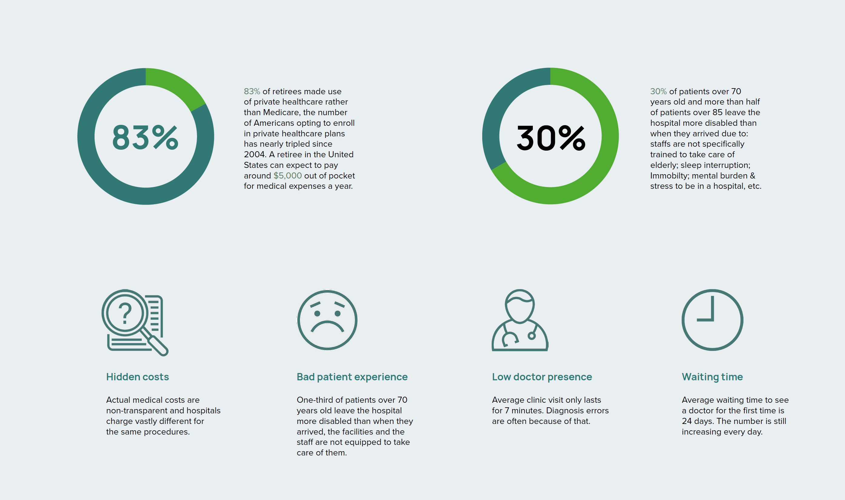
According to The Commonwealth Fund’s Research, 83% of retirees made use of private healthcare rather than Medicare, the number has tripled since 2004. A retiree in the US can expect to pay around $5,000 out of pocket for medical expenses a year. There are usually hidden medical costs that make people pay way more than they are supposed to, and sadly they rarely get good service in return — the average waiting time to see a doctor is very long, and 30% of patients over 70 years old are more incovenienced than when they arrived at the hospital due to bad experience.
Solution
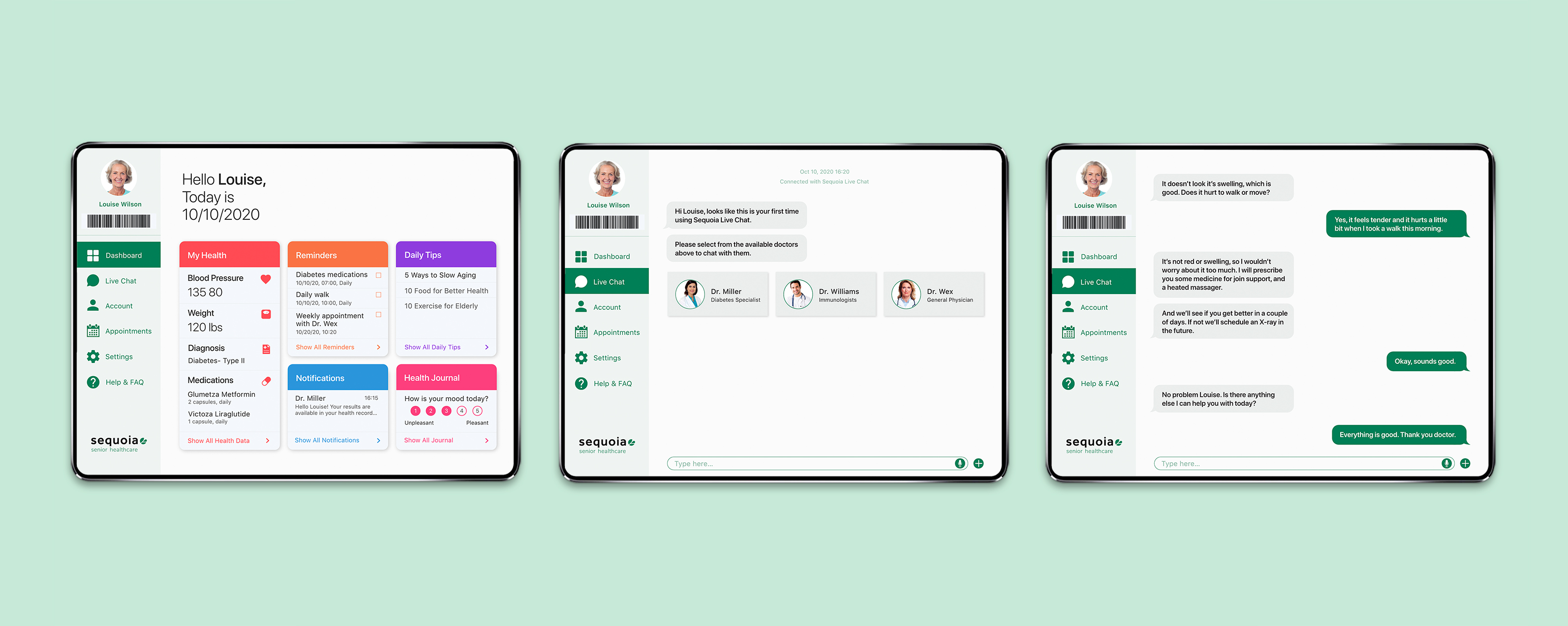
Sequoia is a senior healthcare facility that utilizes the latest technology and offers concierge experience, and Sequoia App is a healthcare app that is used within the facility by staff and patients. As a subscription-based healthcare service, Sequoia believes in patient-centered philosophy, aims to change the way we utilize health insurance in America, and commits to cover all healthcare needs in one place.
Seniors who stay at the facility will get to enjoy the latest technology, which includes Sequoia dashboard App that helps monitor their health and makes it easier to communicate with the doctors. The mission is to create one-on-one relationships with our patients, provide high-quality care, reduce healthcare costs in the long run and therefore, empower the users to be in control of their own well-being through healing and prevention.
Survey Response — Current Healthcare System
Personas


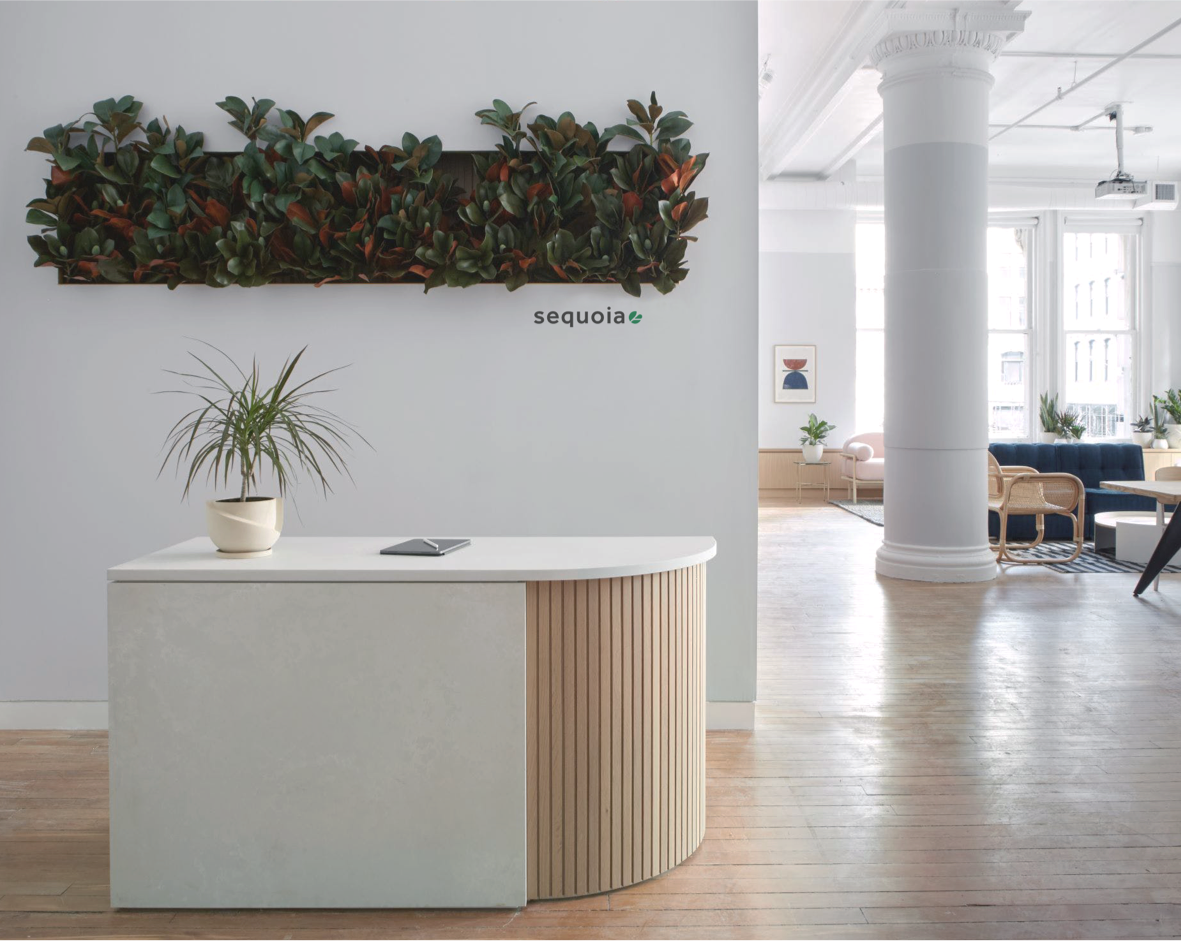
The Facility
- Built with materials that protect against the spread of infection
- Follows biophilic design philosophy and uses natural light and natural elements to help patients feel connected to life and nature
- Sequoia provides a warm, friendly and welcoming ambiance, the interior is neutral colored and decorated with art and plants to reduce stress
- Digital kiosk for patient check-in
- Private waiting rooms and hubs for long term stay
- Private transportation
To see more research and details on the facility, interior design and biophilic design, click here to check out the research document.

On-boarding process
into the facility.

Survey Response — App Features

Ideation

App interface
App interface
We wanted to make the dashboard approachable and easy to use by designing a clean and simple interface. Because our demographics likely have vision problems, we made sure the minimum type size is 16px and the color contrast passes the WCAG accessibility checker.


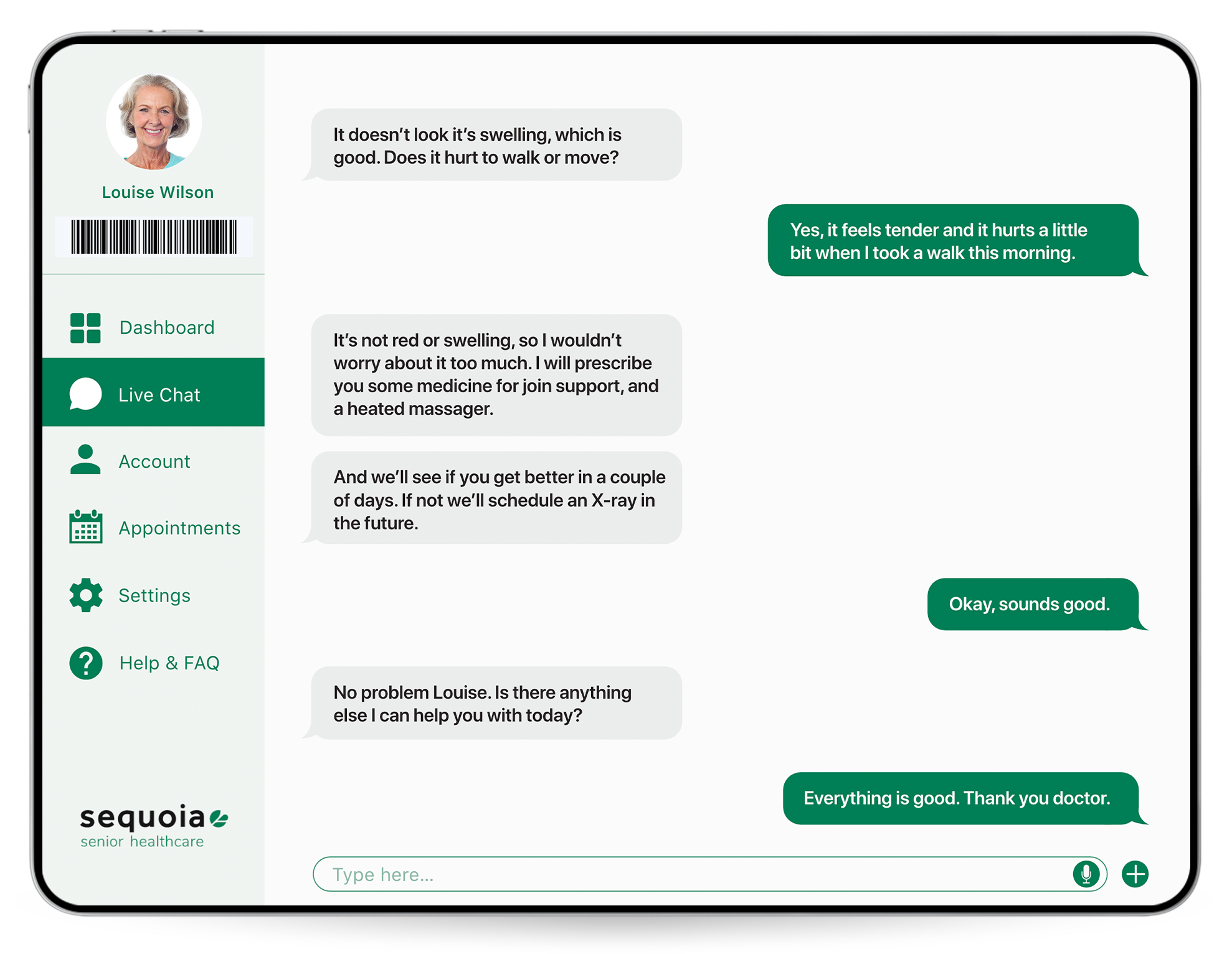
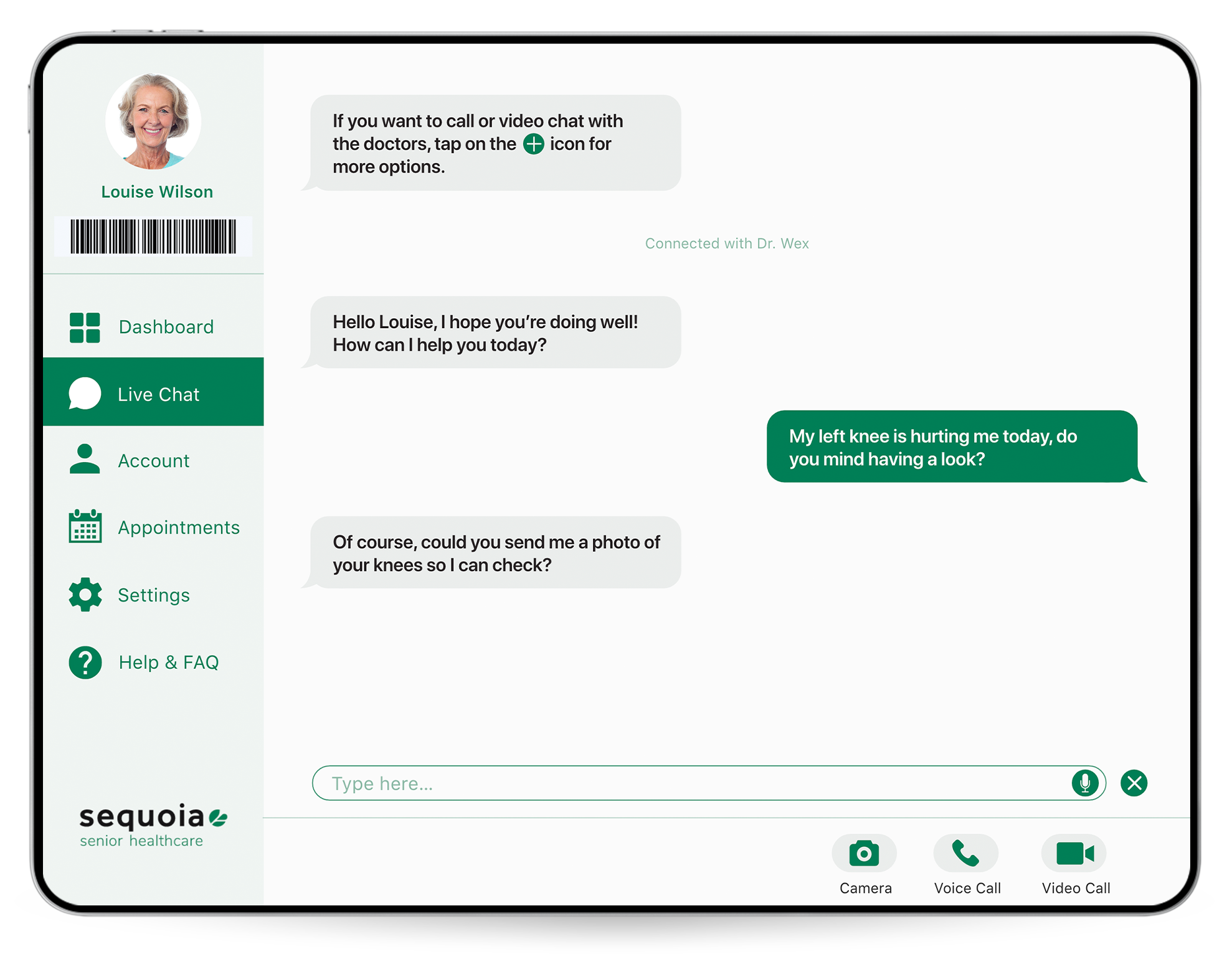
Video of the Main Task Flow: Chatting with a Doctor
Landing Page
Summary
Next Steps
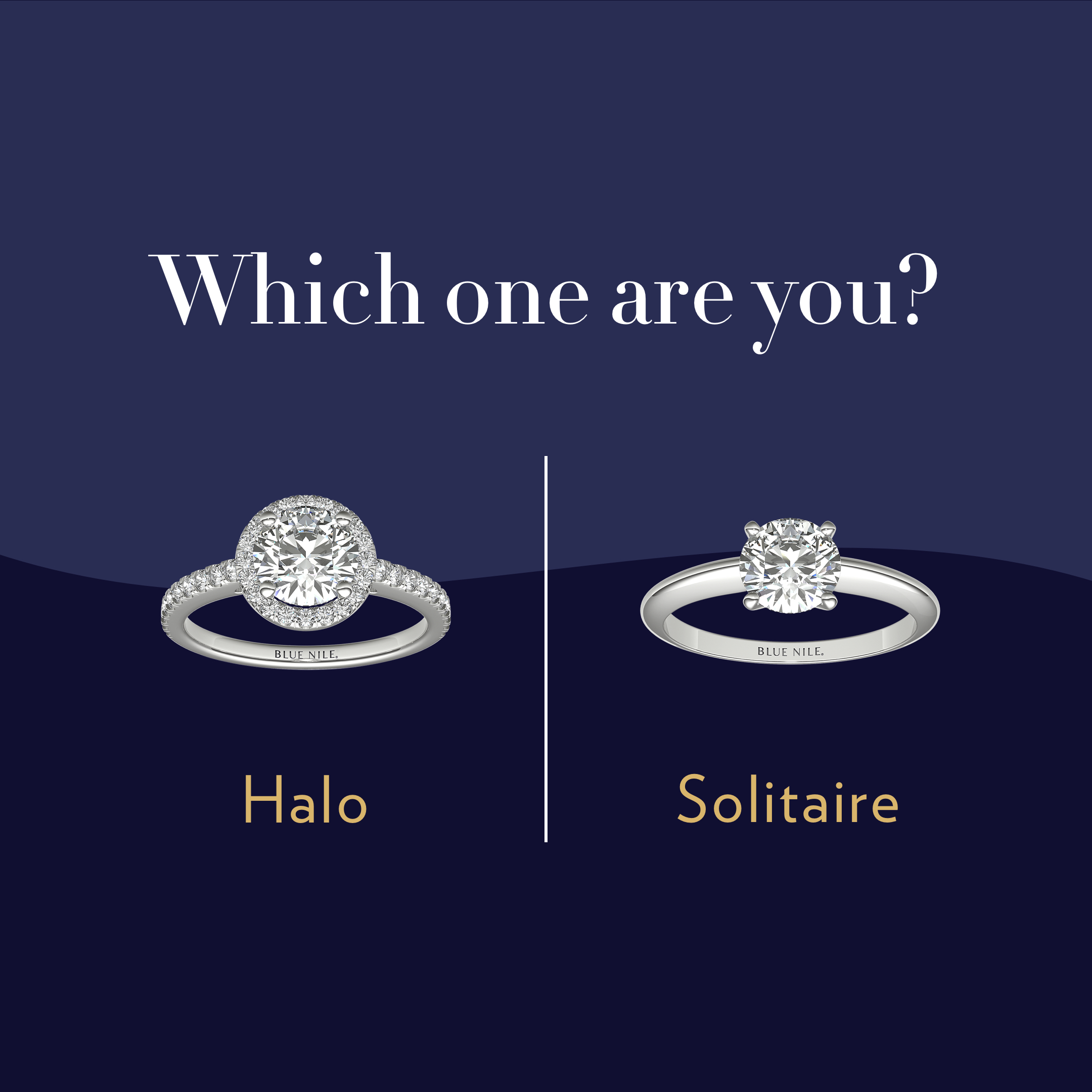
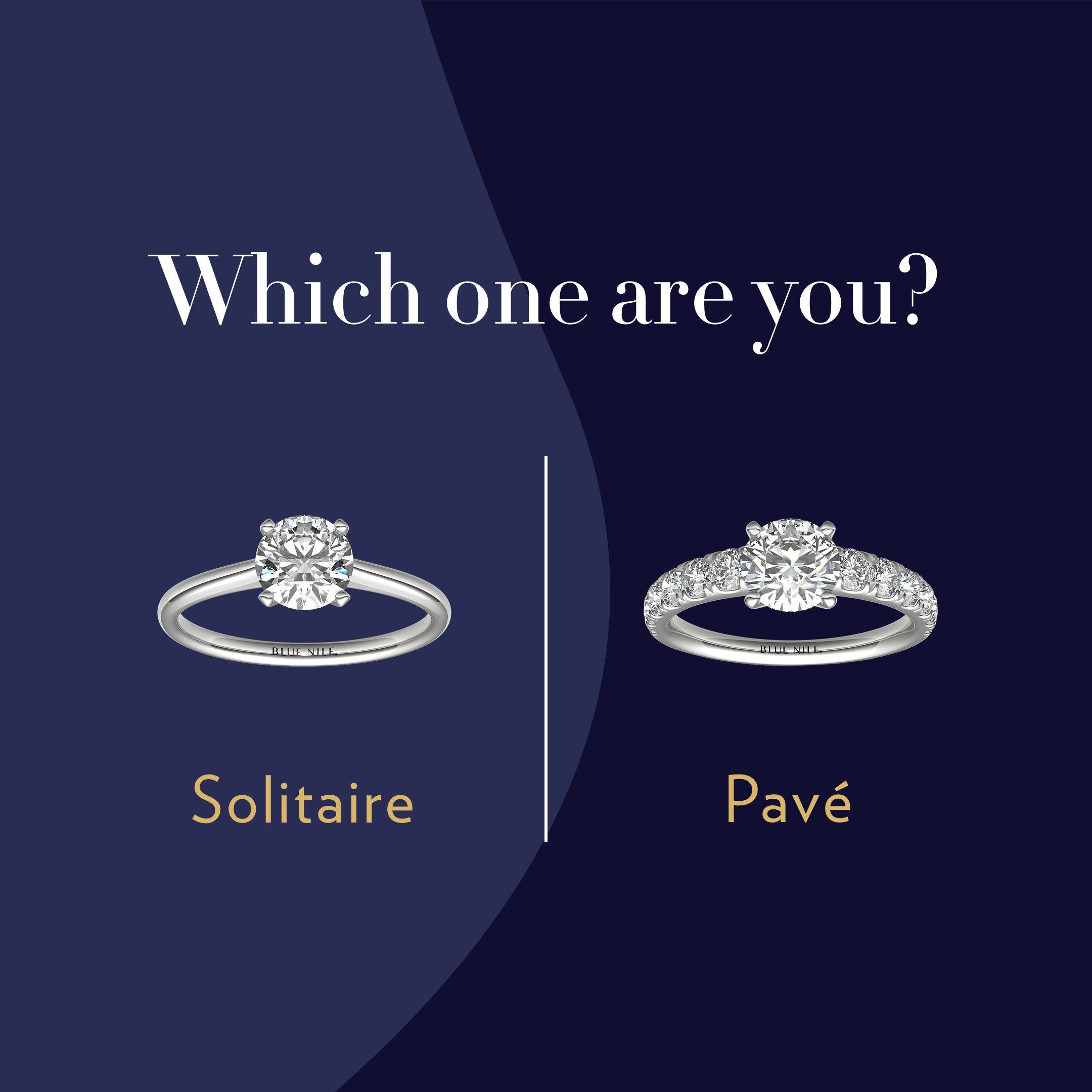
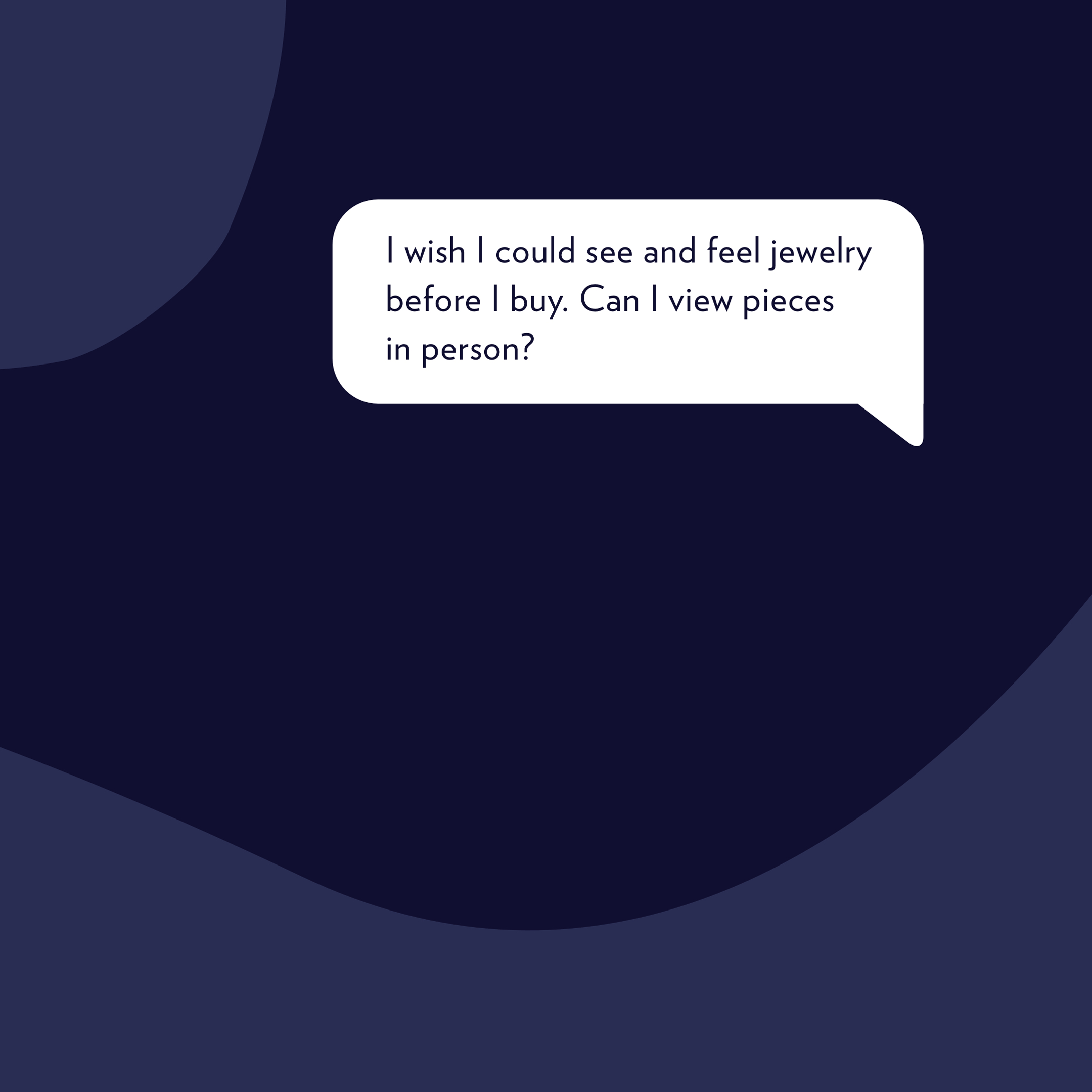
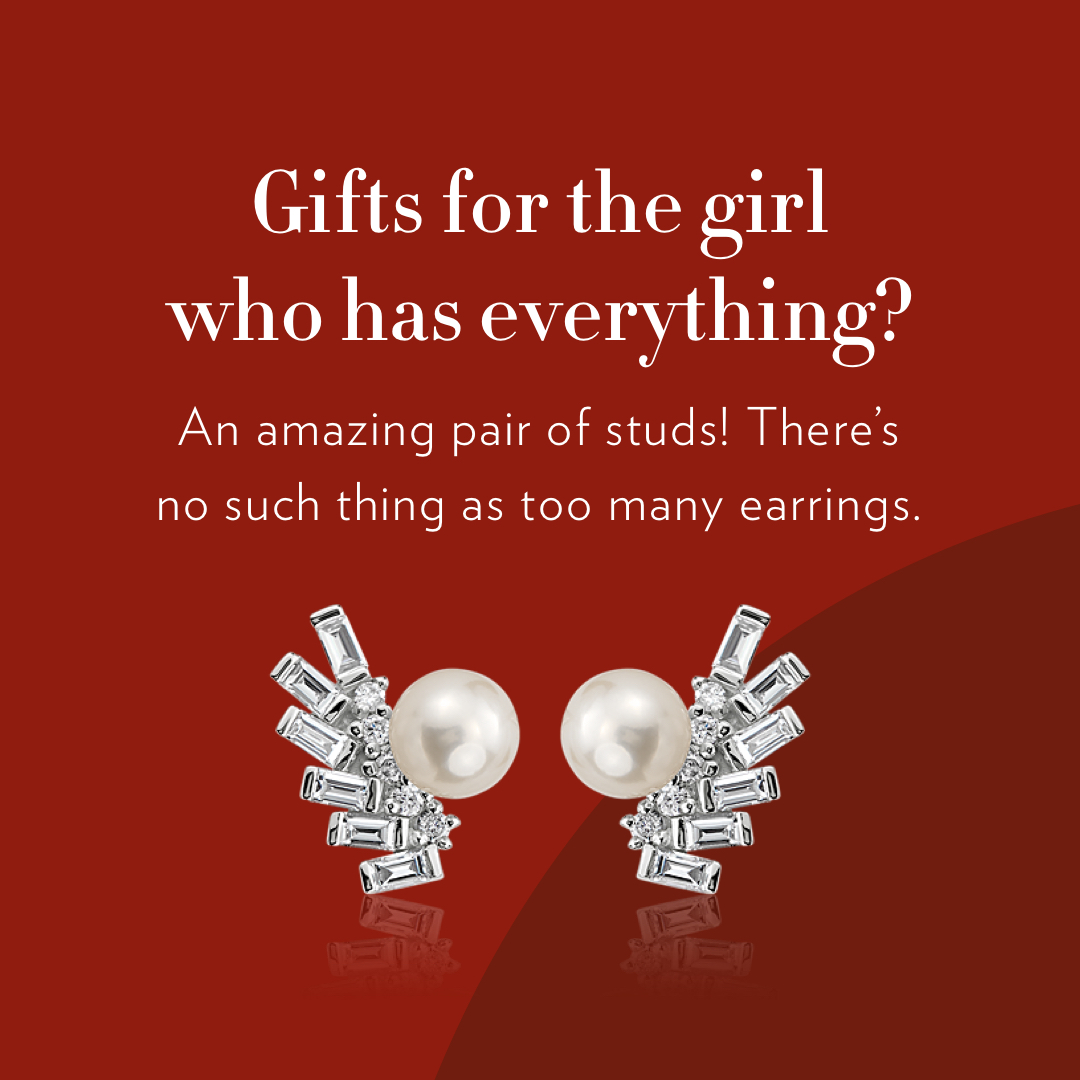
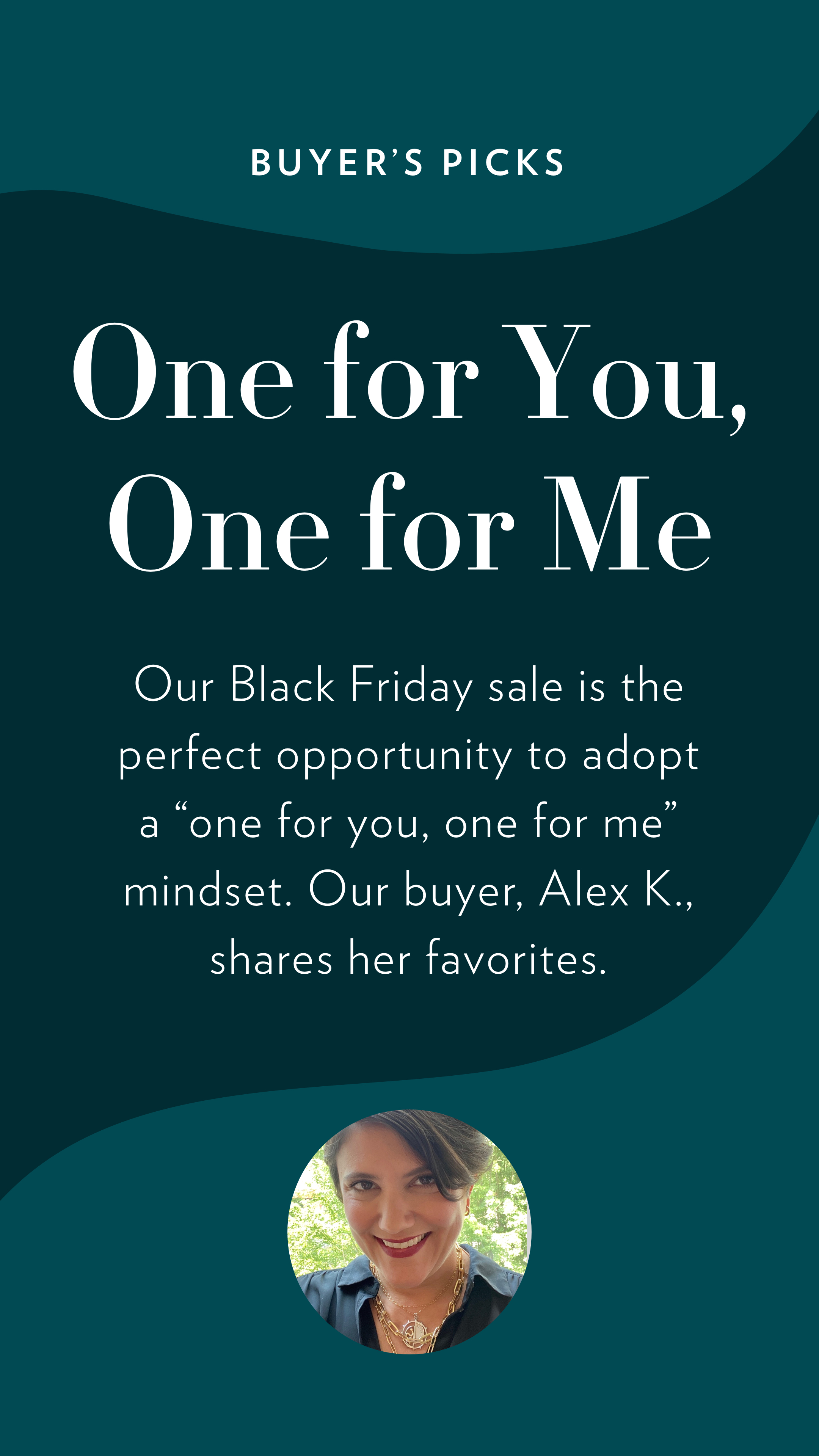
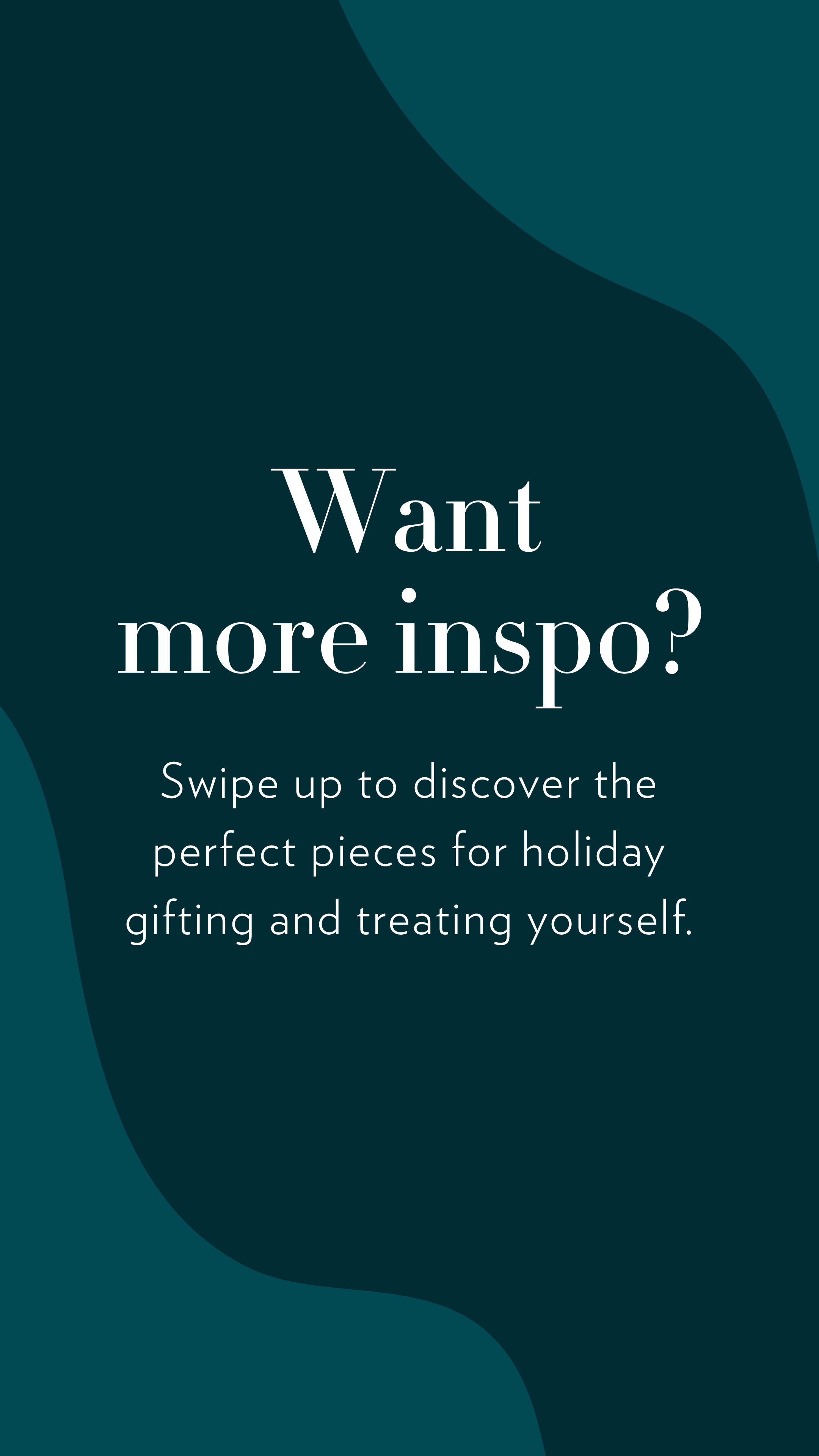
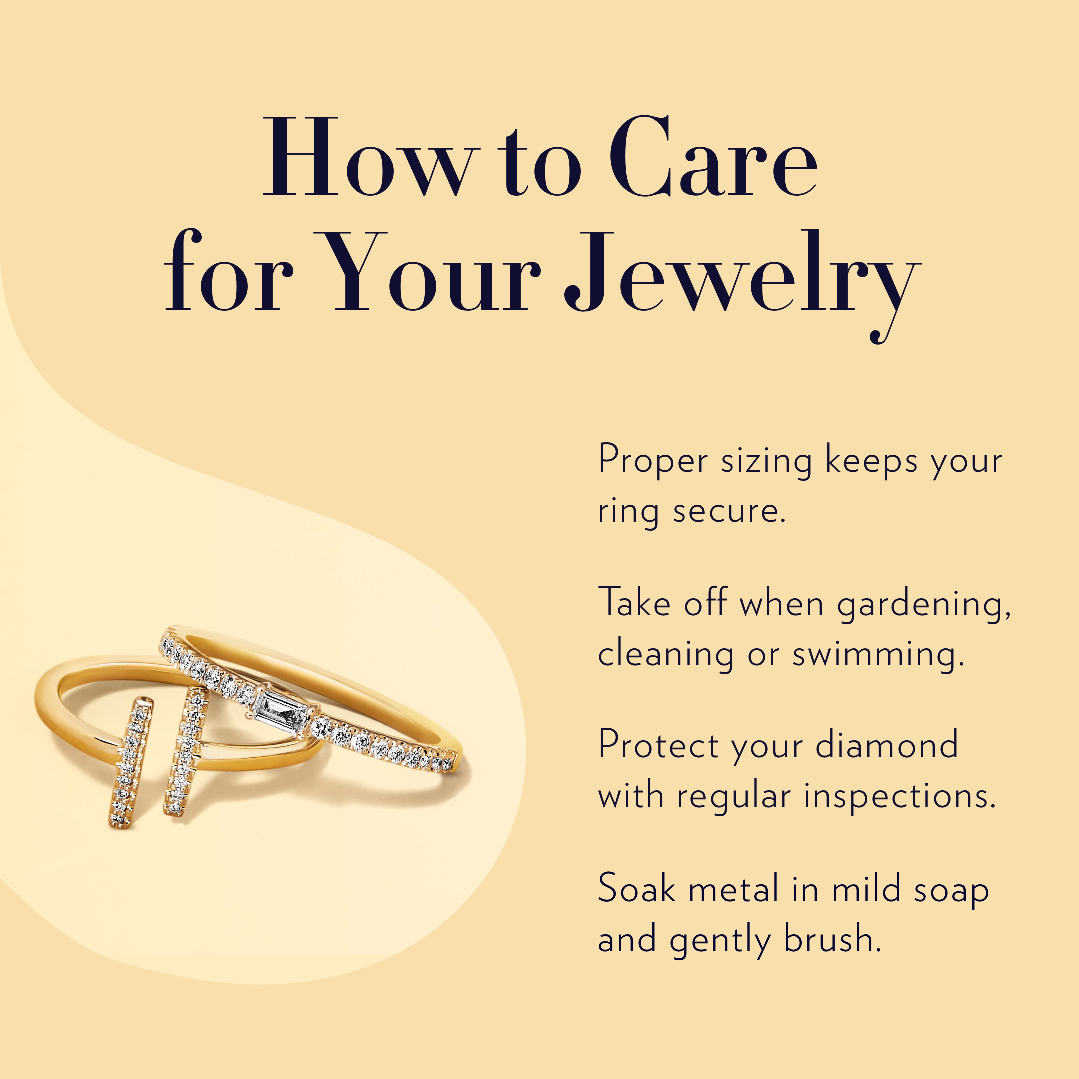
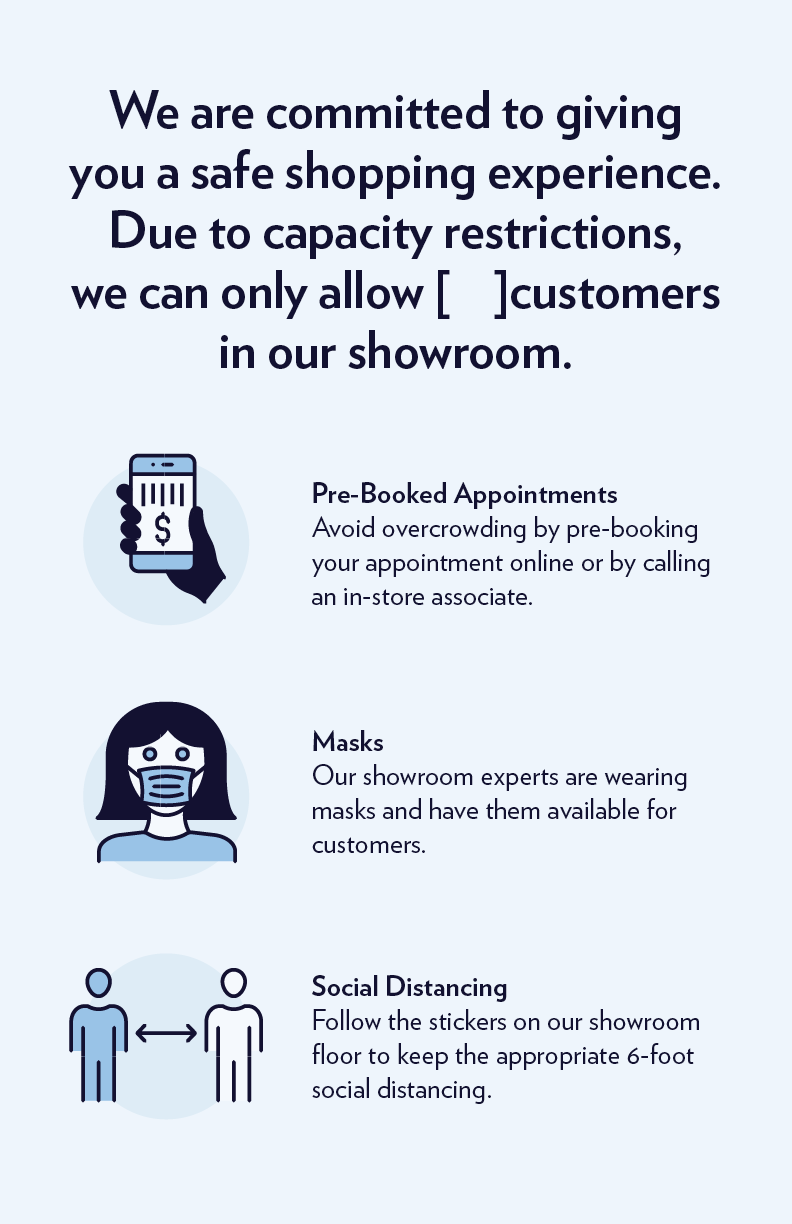
Blue Nile
Blue Nile is a jewelry retail company that was founded in Seattle, it has a wide range of demographic, and as a designer at Blue Nile my job was to create designs that are appealing and accessible to everyone by collaborating with Art Director, developers, other designers and the UX team. My scope of work includes: social media and website assets, ADA compliant marketing templates and redlines, and marketing emails.
Emails
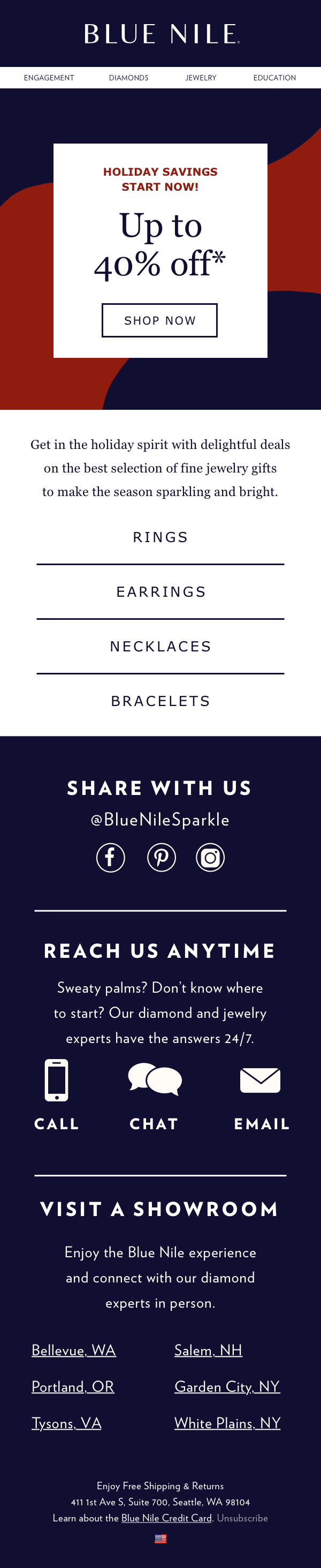


Marketing and Social Media Assets


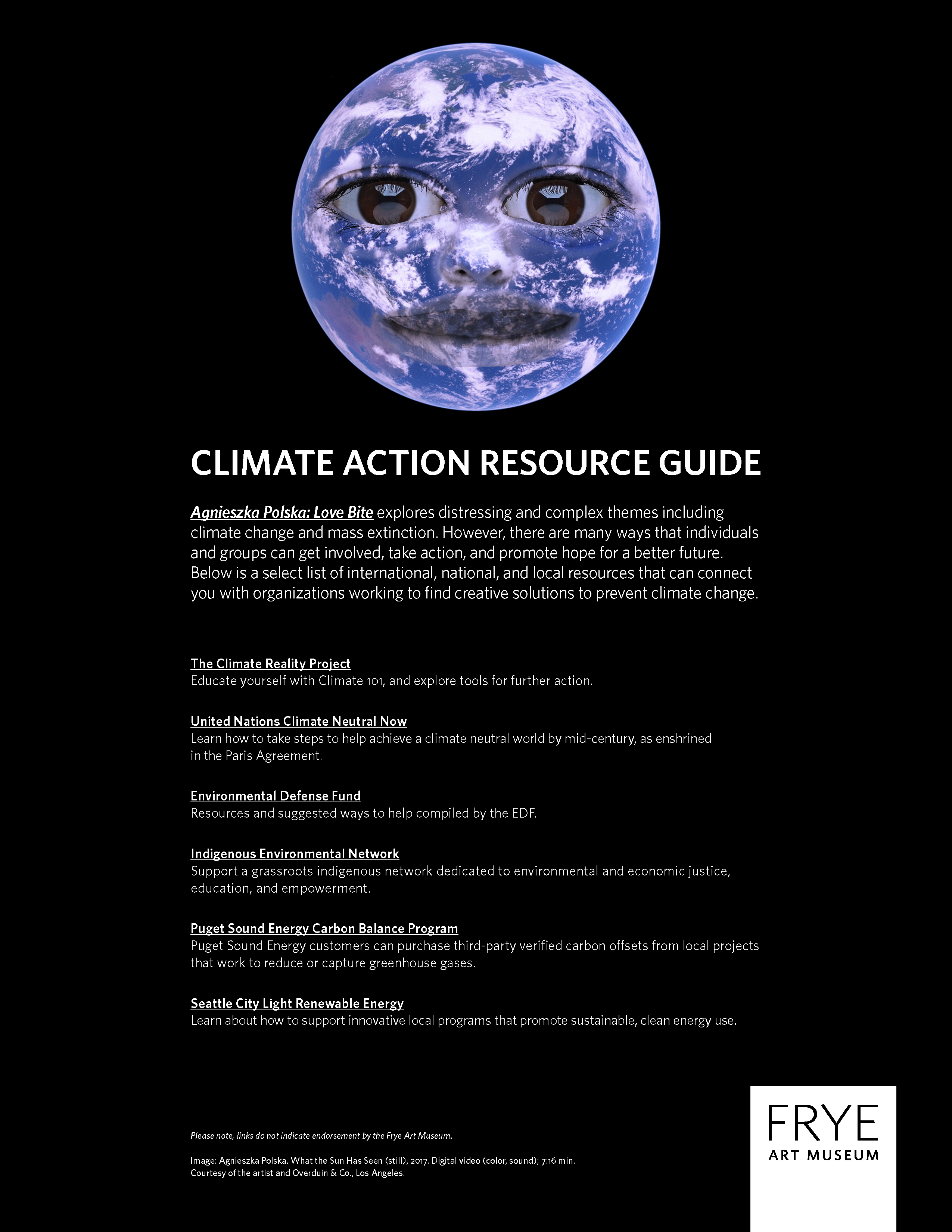
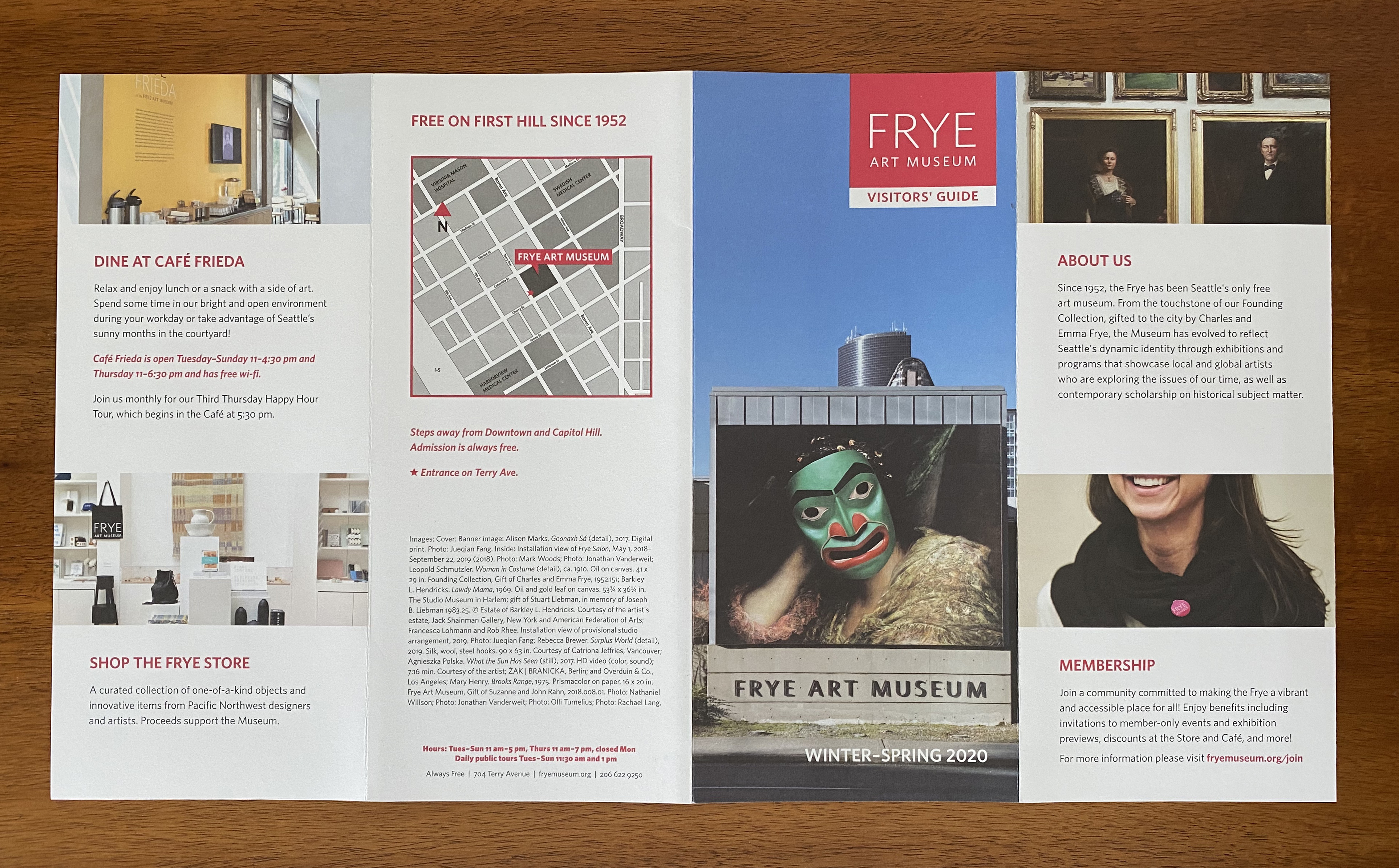
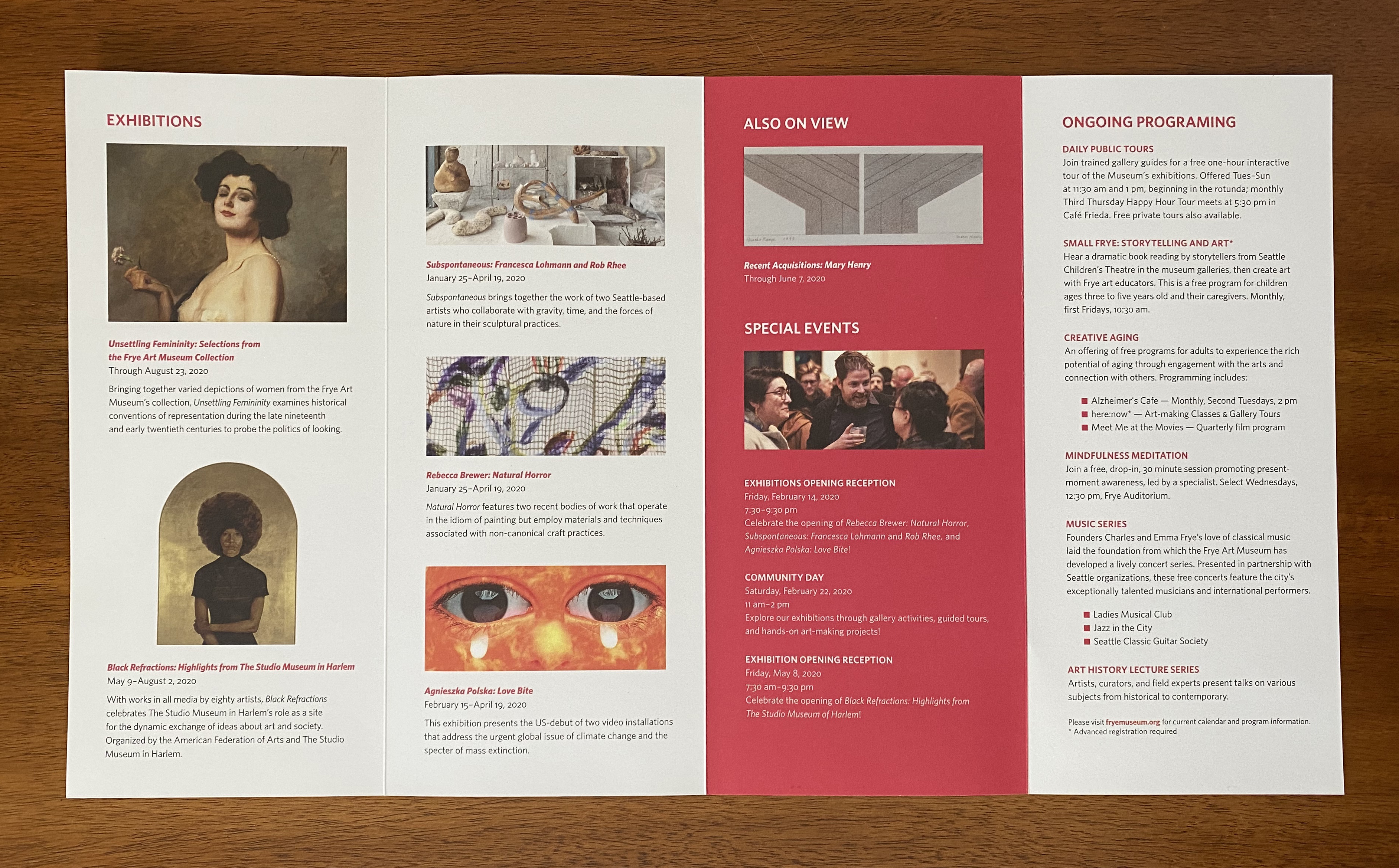
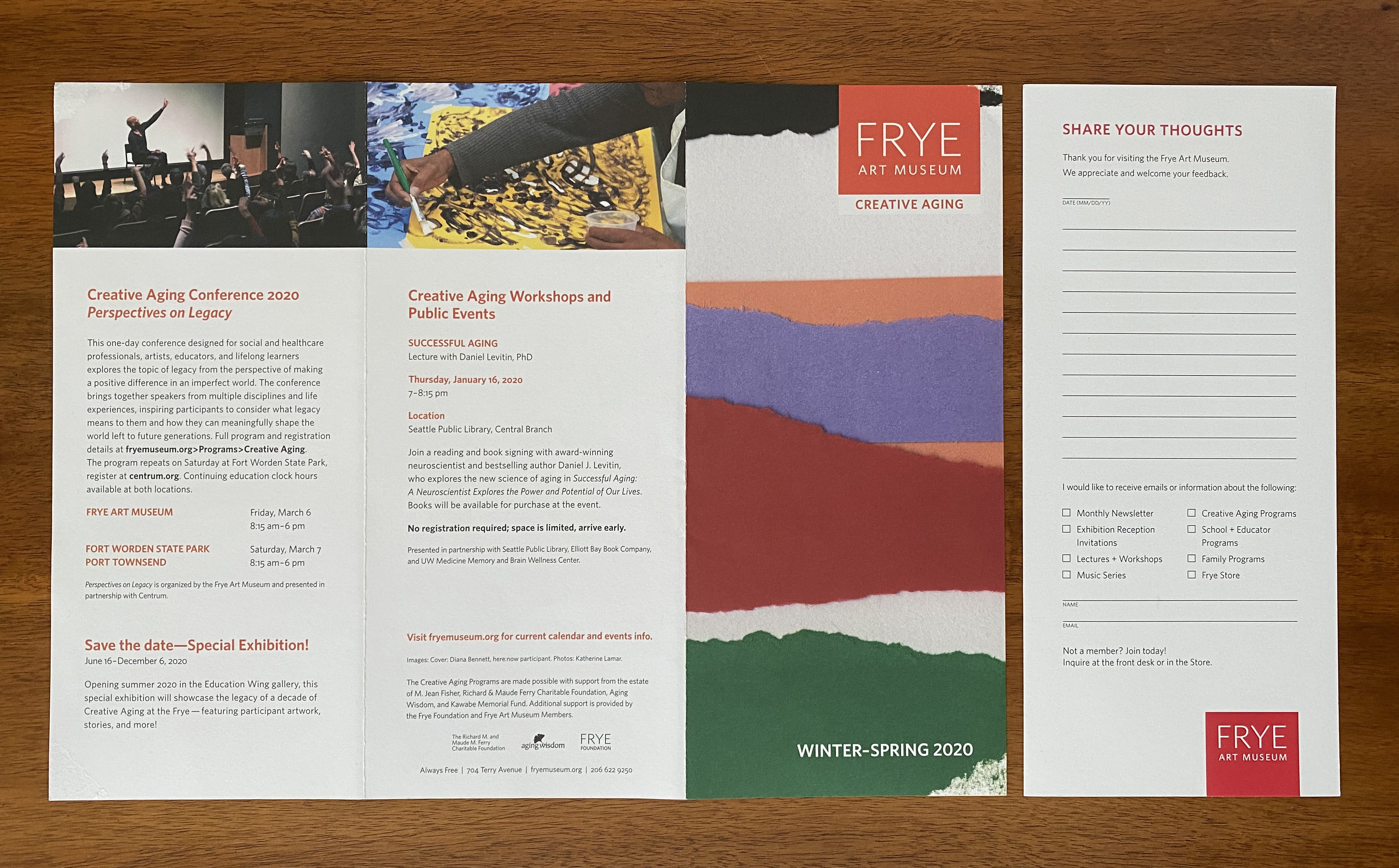
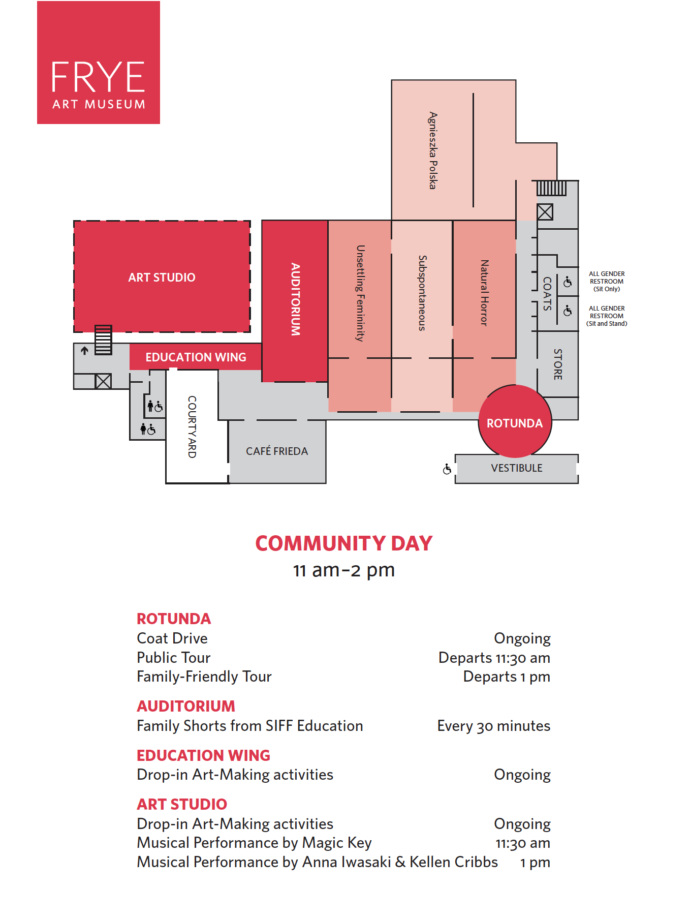
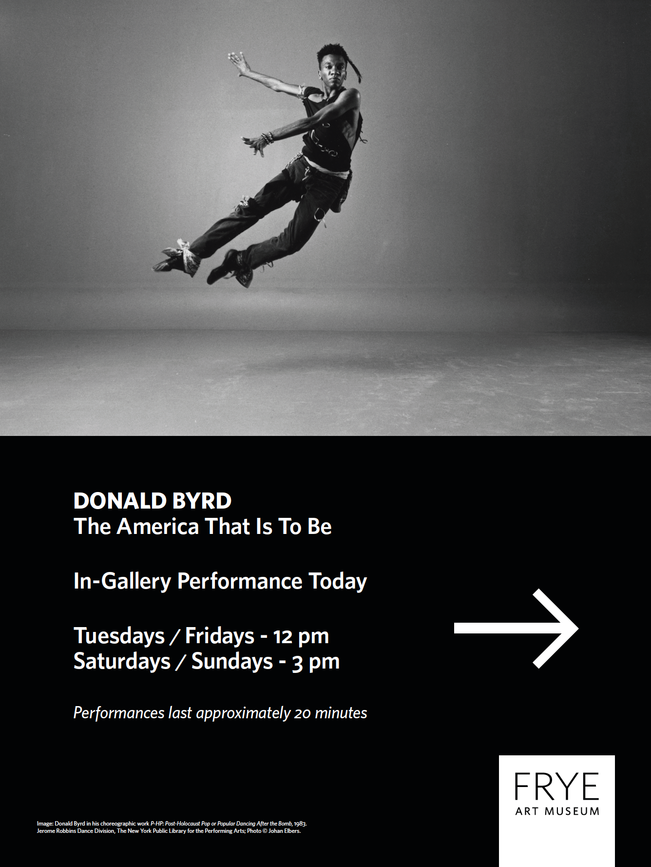
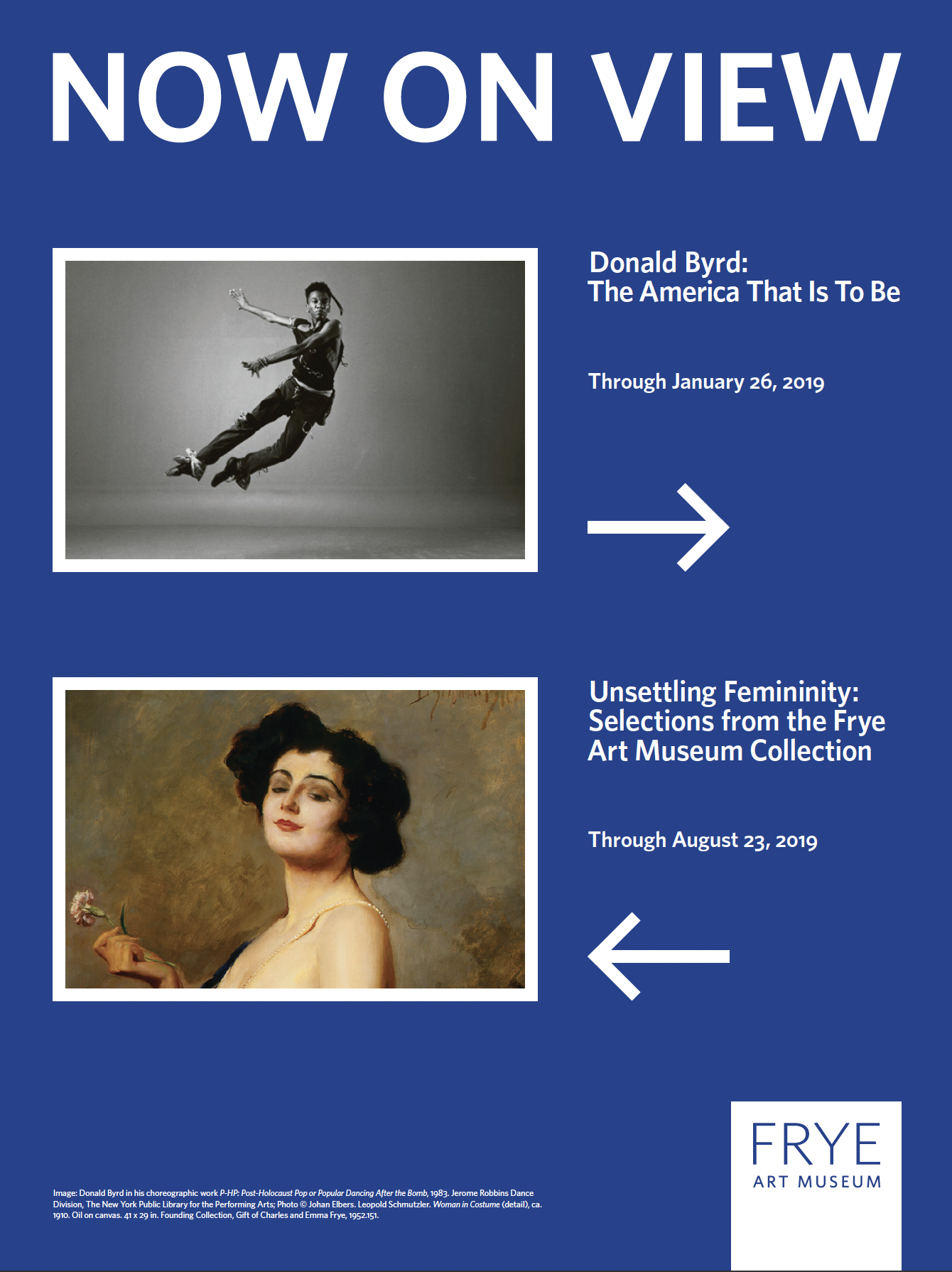
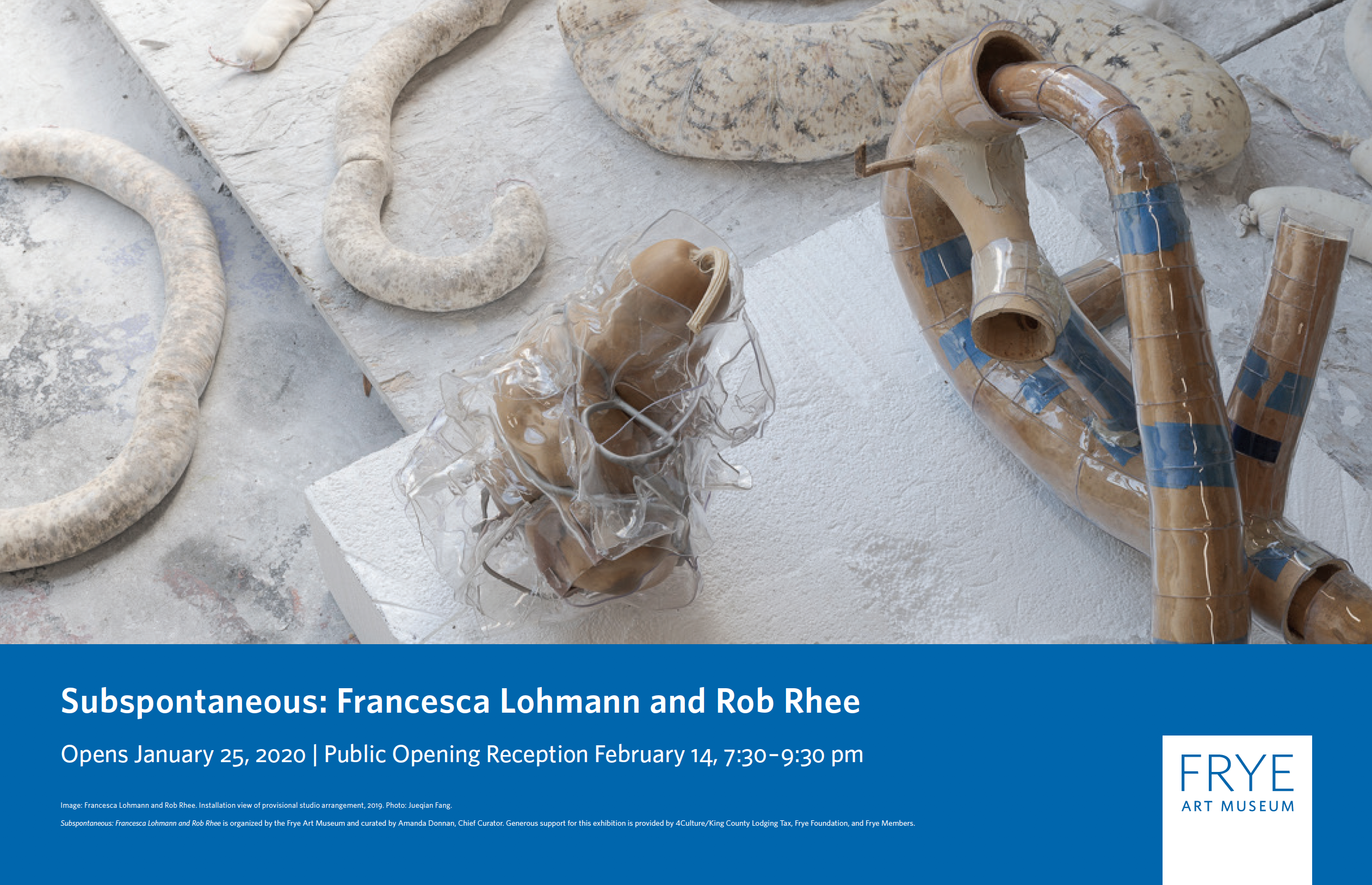
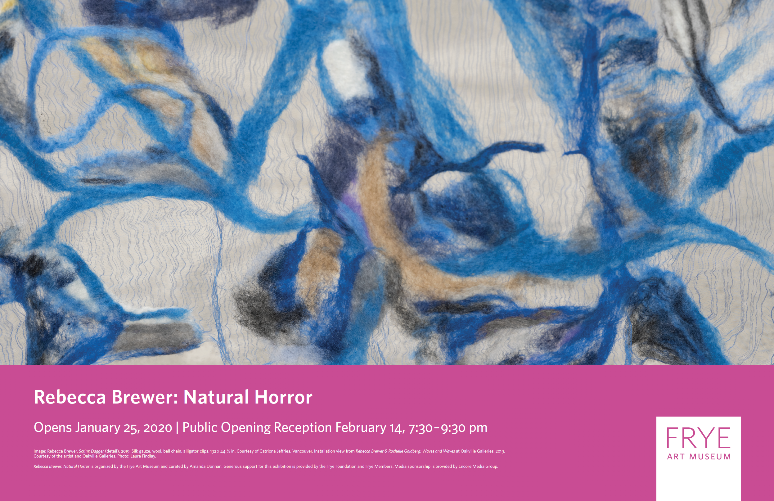
Frye Art Museum
During the time I was working at the Frye, I worked on print materials such as museum posters, brochures, the brand guideline, as well as digital ads for different platforms for various exhibitions and events. Below are some of my design samples.
Brochures

Posters and Wayfinding
Brand Guideline

Digital Content